
Brand Identity Concepts for a County Health & Human Services Agency
Trinity County's Health & Human Services Agency needed a unified visual identity that could work across its three core divisions, Human Services, Health Services, and Administration, while still reading as one cohesive agency.
I developed three distinct logo concepts, each solving that problem a different way:
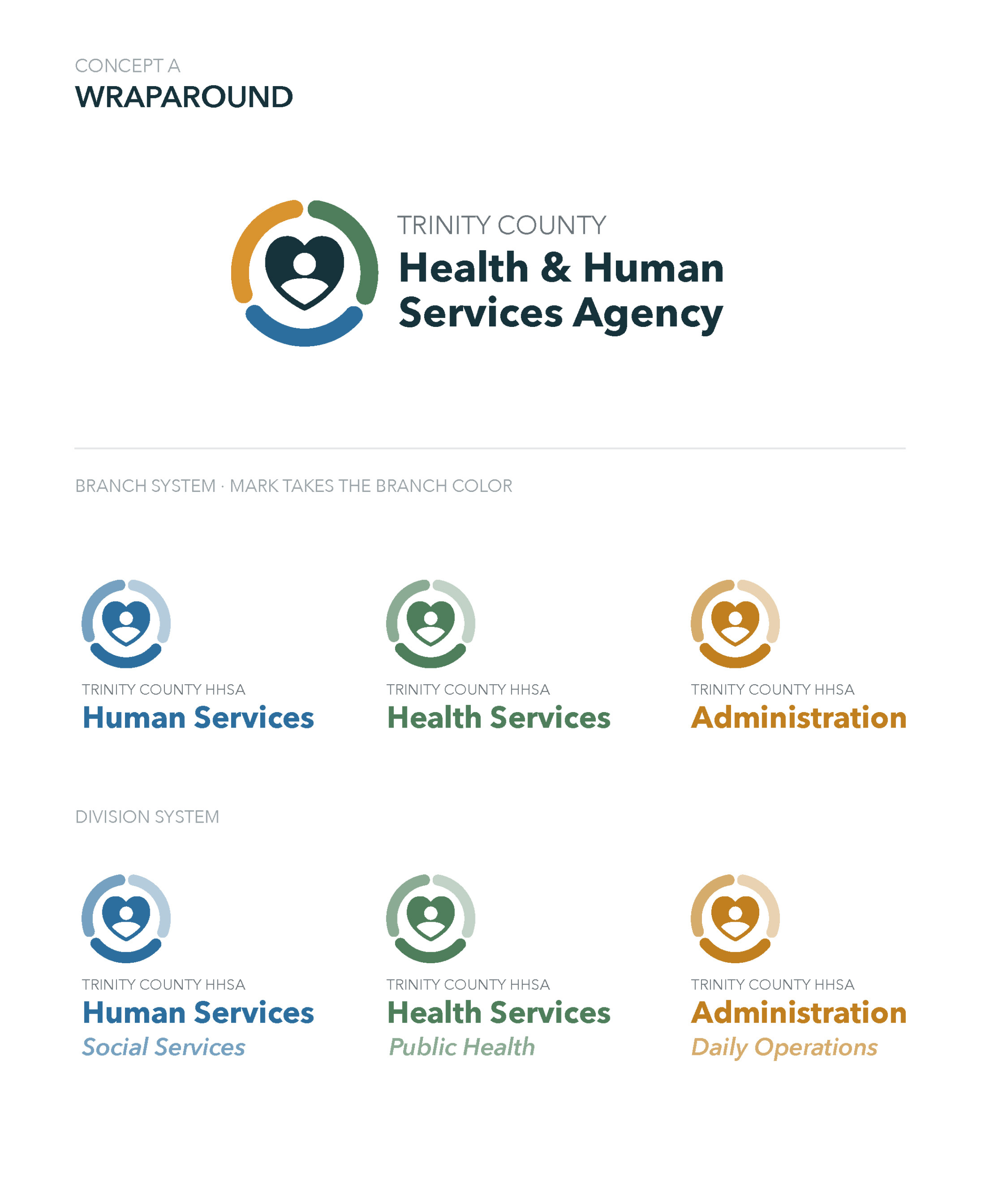
Concept A, Wraparound: A central heart-and-figure mark encircled by a branch-colored arc, with two flexible systems (branch and division) for applying color across departments.
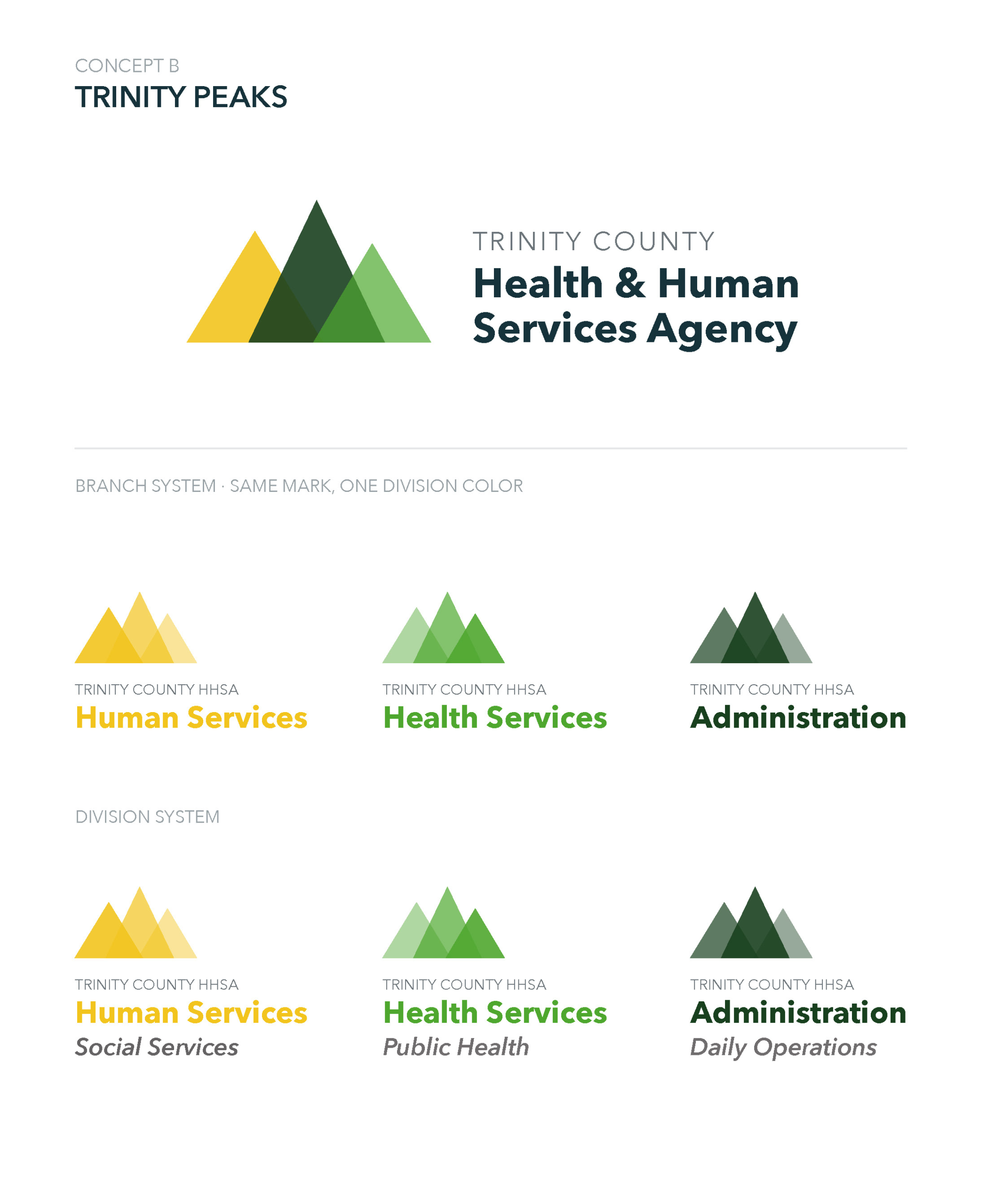
Concept B, Trinity Peaks: Three overlapping peaks forming a single mark, using tonal shifts within one hue per division for a more understated, unified look.
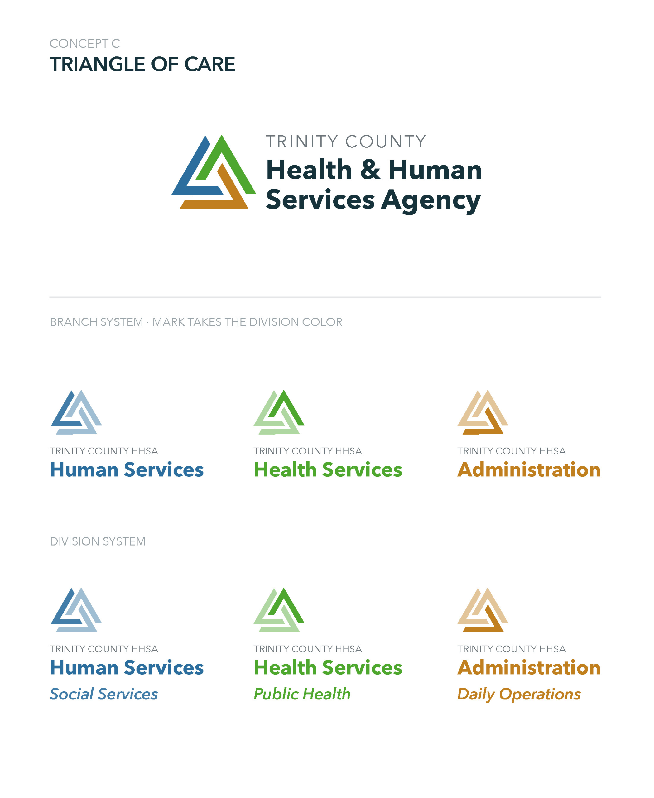
Concept C, Triangle of Care: An interlocking triangle form where the mark itself shifts color by division, offering the most graphic, modern option of the three.
Each concept was built with a full sub-branding system, so individual divisions could carry their own identity while staying visually tied to the parent agency.
Collaboration: Logo concept development completed in collaboration with Caporusso Communications.