Tara Gilvar founded B.I.G. — Believe. Inspire. Grow. — in 2009, when most women’s networking groups still felt like sales floors. She built something different. A pod-based community where women could show up honestly, give before they got, and grow through real relationships instead of transactional networking.
Inside the rooms, it worked. Members talked about the women, the safety, the people. Not the credentials. Not the deals.
Outside the rooms, the brand told a different story.
The original logo, the soft baby blue, the deep red accents, the rotating mix of Canva fonts across sixteen pods — none of it was wrong on its own. But none of it was telling the truth about what B.I.G. actually was, either. The brand read as a generic networking group. What members were experiencing inside was something else entirely.
“We’re a luxury opportunity. We’re for the woman who’s serious. But the brand doesn’t say any of that yet.”
The original ask was simple: refresh the social media templates. Maybe modernize the newsletter. Within thirty minutes of the first call, the real problem was on the table — the brand itself was the bottleneck.
Before a single logo concept was sketched, the work started where it always does — with the people the brand is actually for.
Four customer personas, fully built out. Amy, the seeker. Jessica, the starter. Sandra, the relauncher. Lani, the connector. Each one mapped against five concerns, five goals, and five priorities — the foundation that would later drive every messaging and design decision.
A six-competitor brand audit. Each competitor in the women’s networking and entrepreneurship space was graded across six dimensions and visually plotted against B.I.G. The audit surfaced the white space: every competitor was either too commercial, too dated, or too corporate. None had built a brand that visually communicated the emotional depth women were actually experiencing inside these communities.
A new brand foundation. Mission, vision, six core values, brand personality, and brand goal — all written to reflect what was already true inside B.I.G., not what someone wished were true.
Then, three logo directions. Each one paired with its own tagline and color palette, each one telling a different version of the same story:
Option 1 — The Collective. A flower-pod icon with five interconnected petals, paired with Built on Connection.
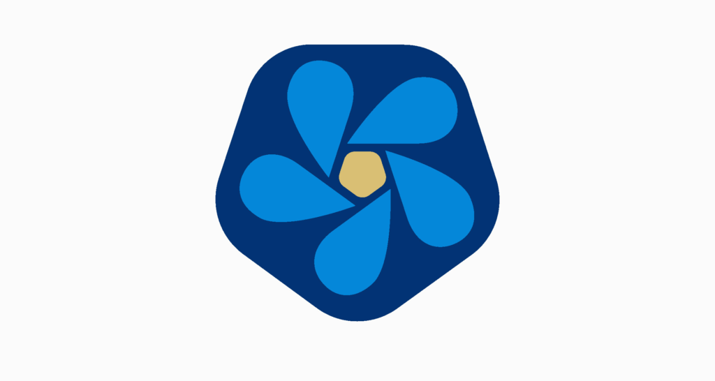
Option 2 — The Community Shield. A pentagon-shaped mark with dynamic, directional petals suggesting forward movement, paired with In Community, We Rise.
Option 3 — The Elevated Wordmark. A typography-led mark in bold serif, paired with Where Women Belong.
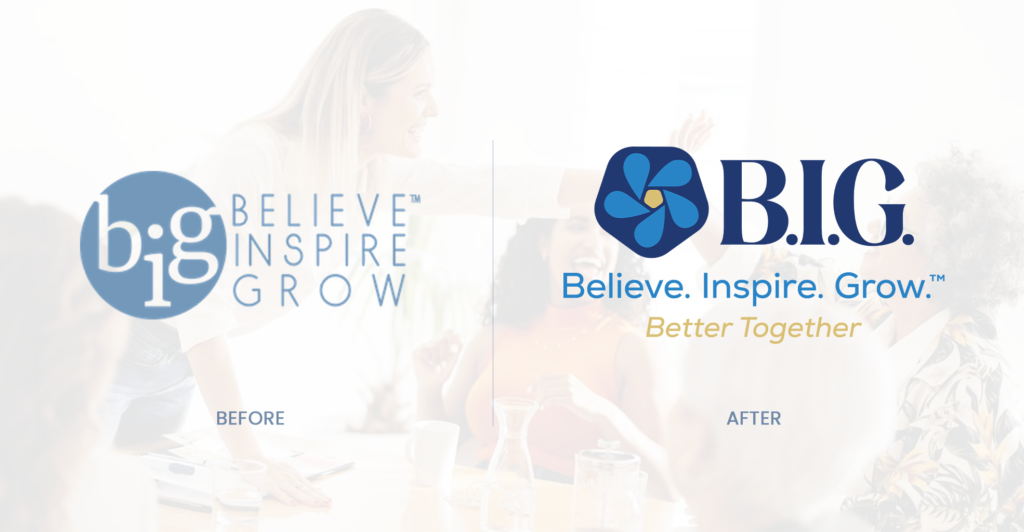
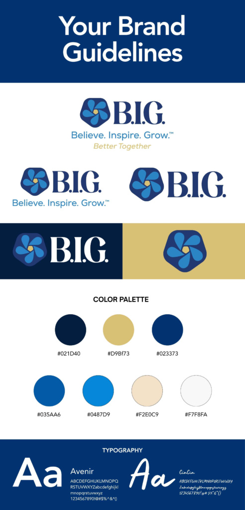
After review, the chosen direction was the Community Shield. The full lockup keeps B.I.G. as the primary mark, Believe. Inspire. Grow. as the established tagline that the community has known for sixteen years, and adds Better Together as the new supporting descriptor — anchored in a refined navy and gold palette with warm sandstone for emotional balance.
The new B.I.G. brand doesn’t try to be louder than its competitors. It tries to be honest about what makes it different.
The Community Shield mark carries five distinct pods around a central core — a visual translation of B.I.G.’s actual structure (sixteen local pods, one connected community, women at the center of all of it). The pentagon shape borrows from the language of strength and protection. The dynamic petals carry momentum, not symmetry. Growth is active, not static.
The typography pairs Avenir — strong, modern, confident — with CinCin, a hand-drawn script that brings warmth without going girly. One says credibility. The other says human.
The color palette is built around two anchors: a deep, confident navy and a gold that reads as sophisticated rather than sweet. Around them sit a saturated mid-blue for momentum, a softer apricot-adjacent sandstone for warmth, and clean whites for breathing room. Nothing about it apologizes for being a women’s organization. Nothing about it leans into stereotype, either.
“”None of them bring it all together like this. None of them have what we have. And now you can finally see it.”
The full system was packaged in a brand guidelines document that pod leaders across sixteen locations could actually use — covering primary and secondary logo lockups, reversed versions for dark backgrounds, the full color palette with hex/RGB/CMYK values, and typography hierarchy. The Canva-first reality of how B.I.G. operates was respected, not fought.
f your business has evolved past the brand it started with — if what’s happening inside no longer matches what people see on the outside — that’s exactly the gap we close. Free 30-minute strategy call. No pressure. Just clarity on what’s working and what isn’t.
Serving established businesses in Morris County, NJ and across the U.S.
We use cookies to improve your experience on our site. By using our site, you consent to cookies.
Websites store cookies to enhance functionality and personalise your experience. You can manage your preferences, but blocking some cookies may impact site performance and services.
Essential cookies enable basic functions and are necessary for the proper function of the website.
One email, straight to your inbox, with the link to that week’s episode.