Play Open
Fia Bars

Fia Bars

Fia Bars
Brand Identity | Logo Design | Packaging | Apparel

Fia Bars

  • Client Fia Bars
  • Date 2025
  • Author Lyon Creatives
The Struggle

A product born from something real. A brand that needed to match it.

Fia Bars didn’t start as a business plan. It started as a response to something deeply personal — a college student watching her mom fight breast cancer and channeling that into creating a whole-food bar that actually nourished the body without compromise. The product took off. The mission was clear. But the brand hadn’t caught up yet.


Clean ingredients and real nutrition deserved more than a generic health food aesthetic. Fia Bars needed an identity that could stand on a shelf, stop a scroll, and tell its story at a glance — without looking like every other bar on the market.

The Work

Energy, warmth, and zero compromise — built into every design decision.

We started with the story and worked outward. The brand needed to feel alive — playful enough to grab attention, trustworthy enough to earn it, and grounded enough to reflect the whole-food mission behind it.


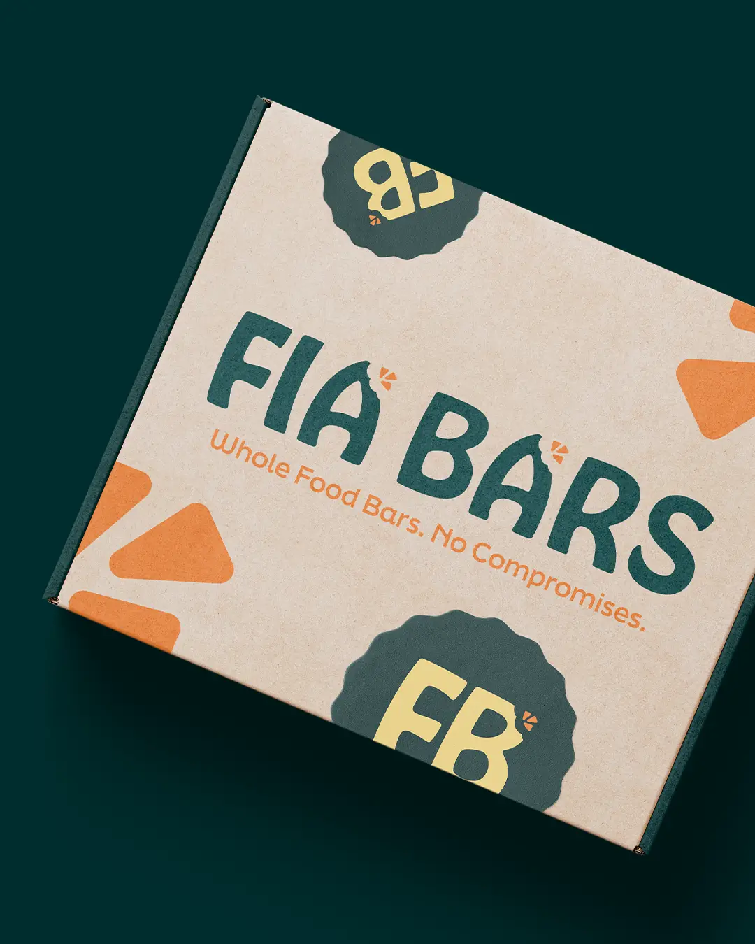
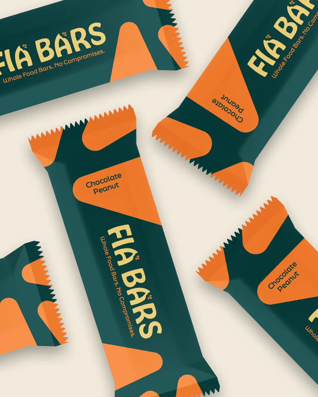
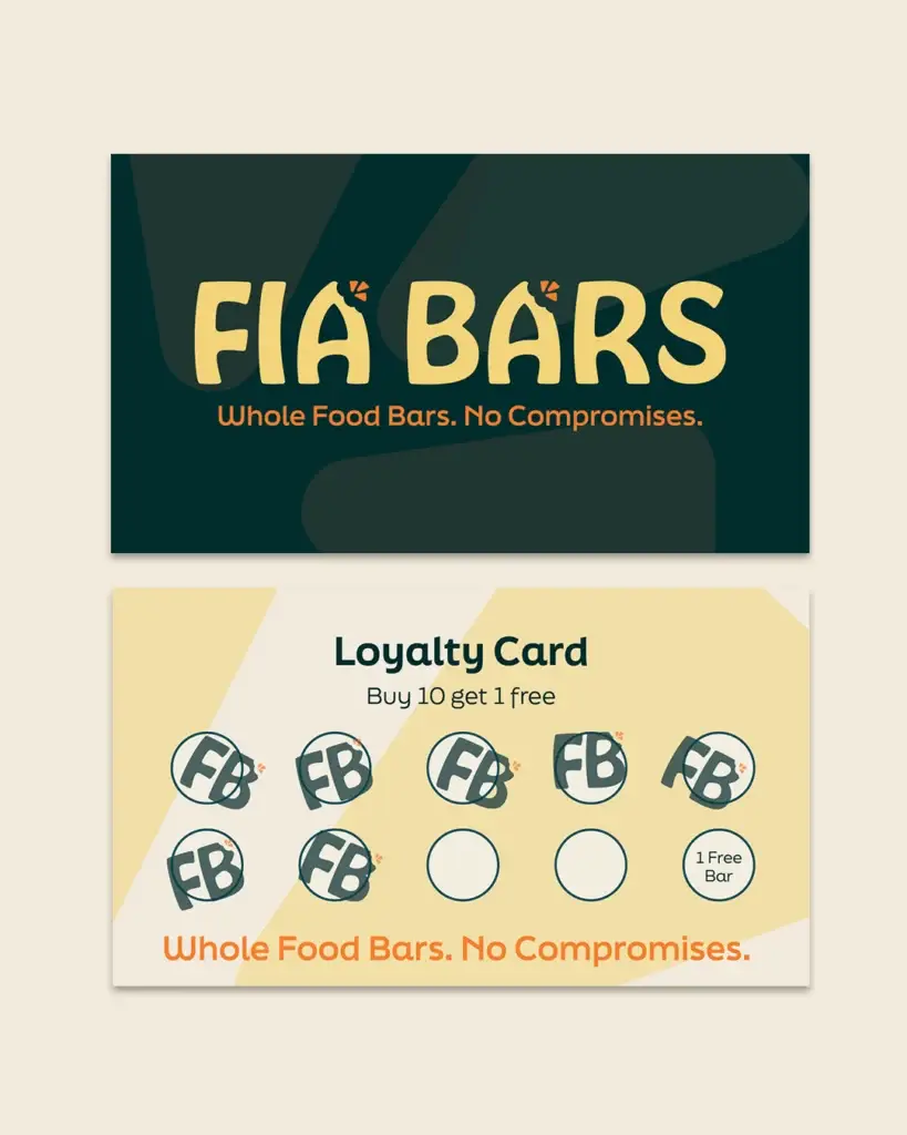
The logo centers on custom rounded typography with an accented ‘A’ featuring radiating marks — a subtle nod to vitality, natural energy, and optimism. It’s friendly without being juvenile. Bold without being aggressive. The tagline “Whole Food Bars. No Compromises.” does the rest.


The color palette pulls from nature and performance: deep teal for trust and purity, vibrant orange for energy and movement, golden fuel for warmth and nourishment, with a grounding oat tone anchoring it all. Nothing artificial — in the bars or the branding.


Typography followed the same logic. Hobeaux Bold brings the personality. Final Six keeps it sharp. Together they balance fun and credibility — exactly what a health brand needs to win over both the athlete and the everyday snacker.


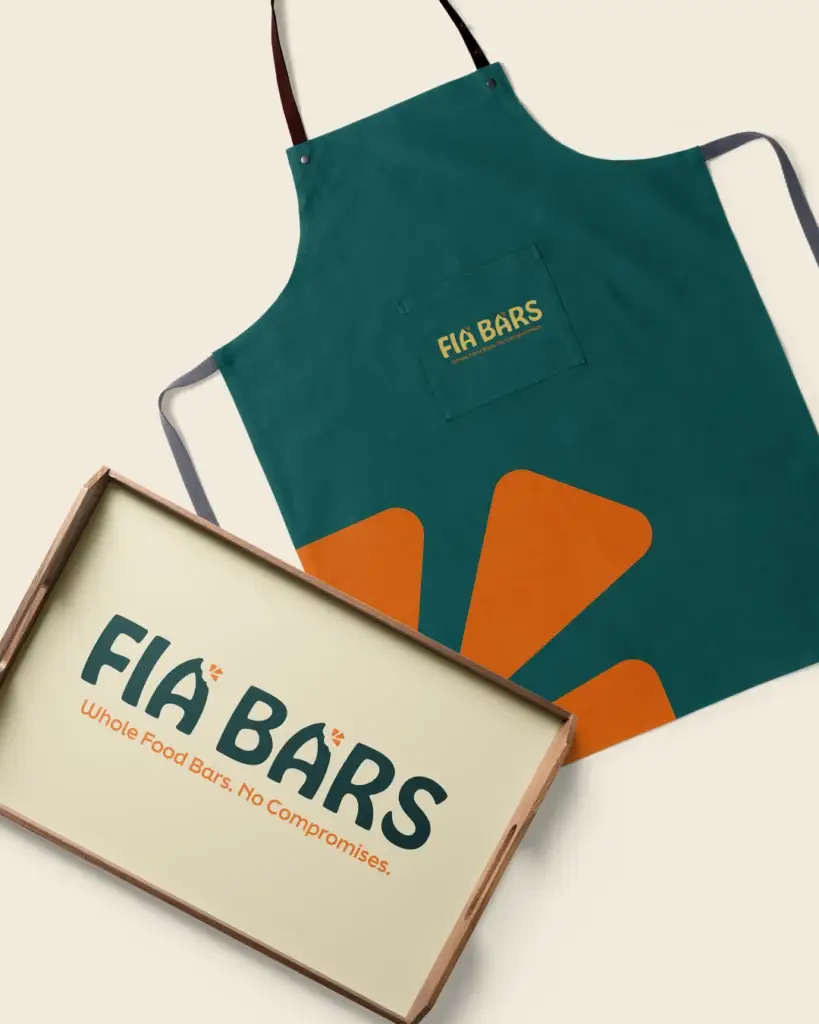
The full system was applied across product packaging, bar wrappers, stickers, shipping boxes, branded aprons, and serving trays — every touchpoint covered.

The Transformation

From a personal mission to a market-ready brand.

With a complete identity in place, Fia Bars went from a compelling product to a compelling brand. The packaging now communicates quality before anyone reads a single ingredient. The visual system is consistent, scalable, and built to grow — whether that’s a farmers market table or a retail shelf.

The Results

A brand as clean as the product inside it.

Fia Bars launched with a full brand system — logo, color palette, typography, packaging, and merchandise — that positions it as a serious, trustworthy player in the whole-food snack market. The identity resonates with health-conscious consumers, athletes, and busy people who refuse to settle for less. And it does it without screaming “health food.” It just looks good, feels honest, and tells the truth.

"If you're starting a business and want to do it right from day one, Lyon Creatives is where you begin. Thank you for everything."
Sofia Weber
Founder, Fia Bars

Your product deserves a brand that works as hard as you do.

Previous Next