Play Open
Mindful Bellies Brand Identity designed by Lyon Creatives - business branding mount olive NJ
Brand Identity | Logo Design | Packaging | Color Palette | Loyalty Card

Mindful Bellies

  • Client Mindful Bellies
  • Date 2025
  • Author Lyon Creatives
http://Mindful%20Bellies%20Brand%20Identity%20designed%20by%20Lyon%20Creatives%20-%20business%20branding%20mount%20olive%20NJ
Mindful Bellies Brand Identity designed by Lyon Creatives - business branding mount olive NJ
The Struggle

A healing mission. No brand to show for it.

Sophia had already changed her life. After years of misdiagnoses, prescription medications that made things worse, and a personal journey through hormonal imbalance and gut dysfunction, she found her way back to health through fermented foods, mindfulness, and clean living. She built Sour Bellies — a nonprofit teaching her community the same — and then launched Mindful Bellies to take it further: workshops, skincare, candles, retreats, a meditation club, and a subscription product line.


The mission was real. The passion was undeniable. But the brand was a ChatGPT logo she didn’t own the rights to, Canva flyers that borrowed fonts and illustrations from other brands, and no visual identity to bring to partners, rec centers, or retreat attendees.


She needed a brand that matched what she had built — and what she was still building.

Mindful Bellies Brand Identity designed by Lyon Creatives - business branding mount olive NJ
The Work

From inner healing to outward identity.

We started with brand strategy — defining the mission, vision, values, and brand personality that would anchor everything. From there, the direction became clear: this brand had to feel like the experience itself. Calm. Grounded. Alive with quiet intention.


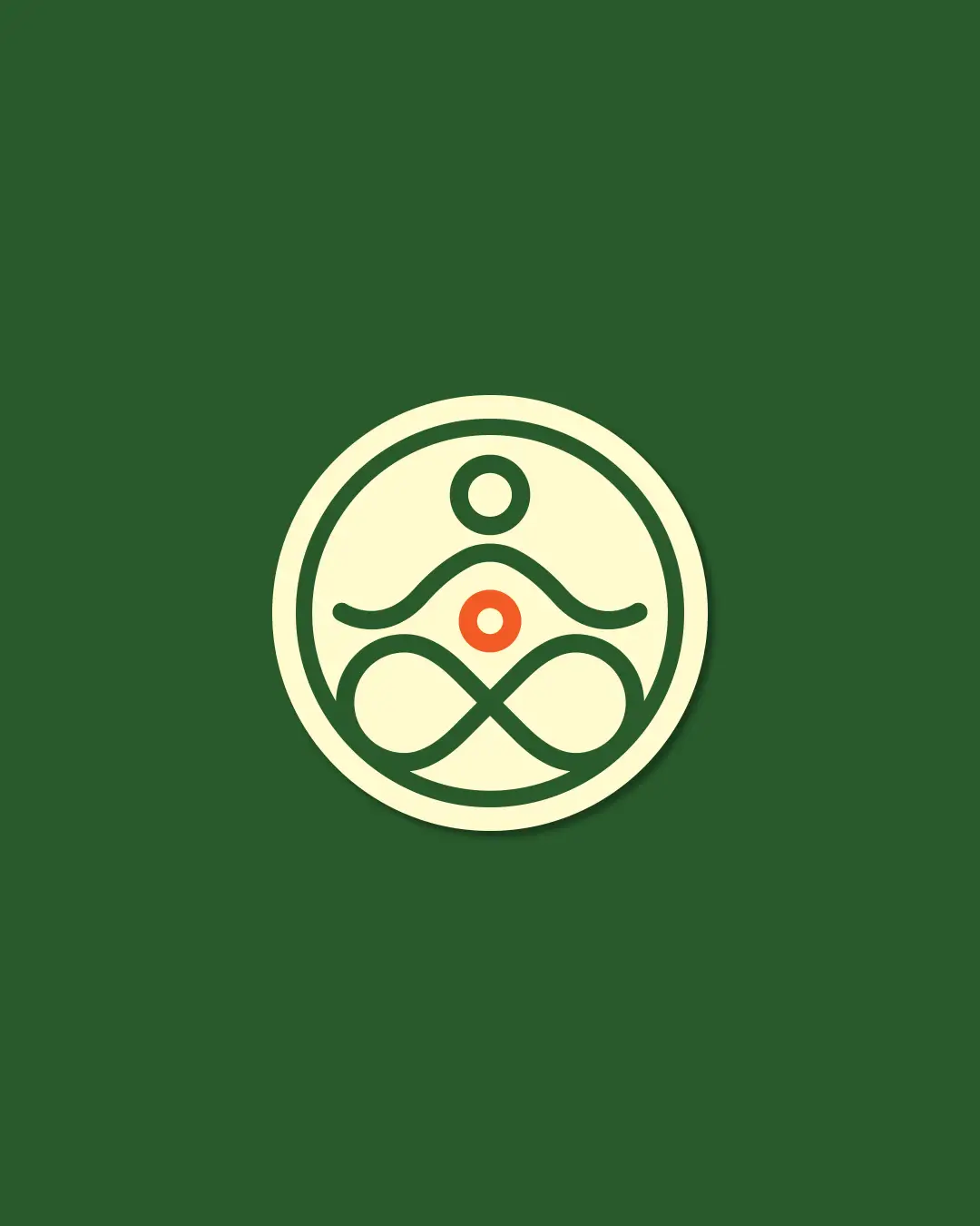
We developed two logo concepts. The winning direction — a seated Buddha within a circle, with an infinity symbol connecting gut and mind — captured exactly what Mindful Bellies stands for. Stillness. Wholeness. A cycle of healing that never stops. Sophia’s one ask: add terracotta to the Buddha’s belly button. Her personality, her warmth, right at the center. Done.


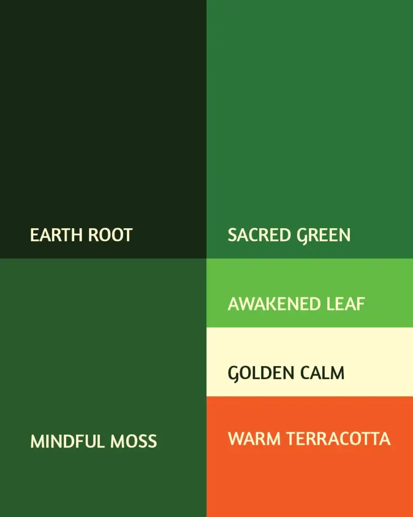
The color palette came from the same place — deep forest greens for stability and nature, soft sage for emotional calm, and warm terracotta as the energetic accent representing vitality and the gut’s emotional core. Every shade had a reason.


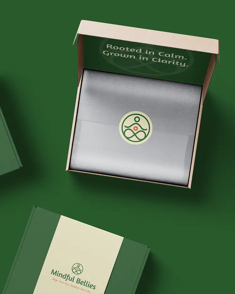
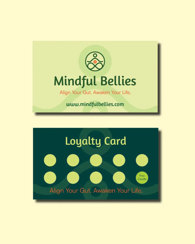
We also designed packaging mockups, a loyalty card program for workshop attendees, and walked Sophia through brand usage — how to use her logo files, which versions go where, and how to maintain consistency in Canva so the brand stays cohesive even when she’s building flyers at midnight.

The Transformation

A brand built to grow with the mission.

Mindful Bellies launched with a cohesive brand presence — logo system, packaging design, loyalty cards, color palette, and brand usage guidelines — that works across workshops, product lines, social media, and future retreats. Sophia has the tools to show up professionally everywhere the brand needs to go, from the Flanders Park gazebo to a full gut health retreat in September.


The brand now supports partnerships with local rec centers, community collaboration with other nonprofits, and a growing product line — all under one clear, consistent identity.

"I love the concept. You did an amazing job. The whole package is amazing, beautiful. I think you captured my vision — everything that you're mentioning is what I envisioned the brand would be."
Sophia Curtis
Founder, Mindful Bellies

Ready to build a brand that actually reflects your mission?