The Challenge
Fia Bars, a whole-food snack brand, needed a fresh, playful, and energetic identity that reflected its commitment to clean ingredients and real nutrition. The goal was to create a vibrant, approachable, and memorable brand that would resonate with health-conscious consumers, athletes, and on-the-go individuals.
Our Approach
we developed a fun and inviting brand identity that captures Fia Bars' passion for wholesome, no-compromise nutrition:
Playful Logo Design – A bold yet friendly custom type treatment with organic, dynamic elements that convey movement, energy, and vitality.
Vibrant Color Palette – A mix of earthy greens, energizing oranges, and warm golden hues, representing clean ingredients and sustained energy.
Typography Pairing – A balance of strong, modern fonts and organic, expressive elements to reinforce trust and authenticity.
Brand Personality & Messaging – A voice that is friendly, encouraging, and empowering, making Fia Bars feel like your go-to snack for fueling your best self.
Fia Bars - Branding Refresh
Fueling a Brand with Energy, Wholesome Ingredients & Playful Personality
Logo & Iconography: A Symbol of Natural Energy
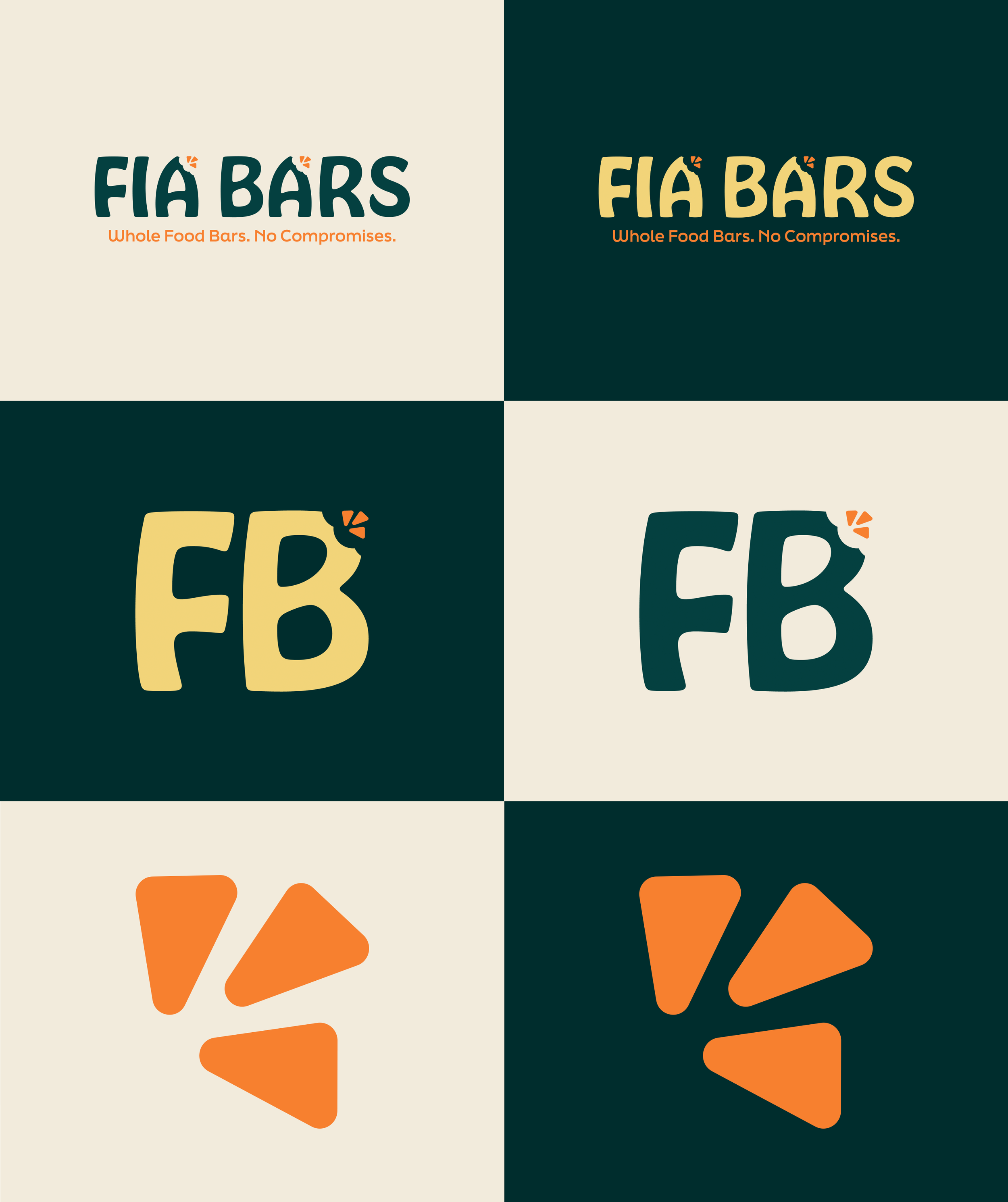
At the core of Fia Bars' identity is a playful, dynamic logo that reflects the brand’s commitment to real, whole-food nutrition and sustained energy. The design embraces a fun, approachable aesthetic while maintaining a sense of trust and quality.
The custom, rounded typography adds a friendly and organic feel, reinforcing the brand’s commitment to clean ingredients and real nutrition. The accented 'A' with radiating marks symbolizes vitality, optimism, and natural energy, making the logo feel energetic and inviting. The tagline, "Whole Food Bars. No Compromises.", further emphasizes Fia Bars' dedication to high-quality, nourishing snacks with no unnecessary additives.
Color Palette: A Balance of Nature And Energy
To capture the essence of whole-food goodness and high-energy performance, we developed a vibrant yet earthy color palette:
Deep Teal – Represents trust, balance, and natural purity.
Evergreen Teal – Symbolizes fresh, clean, whole-food ingredients.
Vibrant Orange – Evokes energy, movement, and performance.
Golden Fuel – Highlights nourishment, strength, and warmth.
Wholesome Oat – A natural, grounding color for whole-food ingredients.
These colors work together to reflect Fia Bars’ balance of clean eating, energy, and a fun, active lifestyle.
Typography: Playful, Clean & High-Performance
The combination of Hobeaux Bold and Final Six adds both structure and personality to the Fia Bars brand.
Font Pairing:
Hobeaux Bold – A bold, rounded font that conveys playfulness and approachability.
Final Six – A clean, modern sans-serif used for the tagline, ensuring clarity and impact.
Together, these typefaces reinforce Fia Bars' dynamic, friendly, and performance-driven identity.
Brand Application: Bringing the Identity to Life
A strong brand identity extends beyond just a logo—it needs to be versatile and engaging across all brand touchpoints. We applied the branding to:
Product Packaging – Bar wrappers, stickers, and boxes.
Merchandise & Serving Materials – Branded aprons and serving trays.
The Impact
The refreshed branding for Fia Bars has positioned it as a trustworthy, fun, and energizing brand in the whole-food snack market. The combination of playful typography, natural energy-driven iconography, and a vibrant color palette has created a memorable and engaging identity that resonates with health-conscious consumers, athletes, and busy individuals.
Ready to Elevate Your Brand?
Lyon Creatives specializes in crafting purposeful, engaging branding that tells your story and connects with your audience. Let’s bring your vision to life! Contact us today to get started.


